Case Study
Purchasing Platform
From icon-only navigation and broken search URLs to a structured, AI-powered procurement experience.
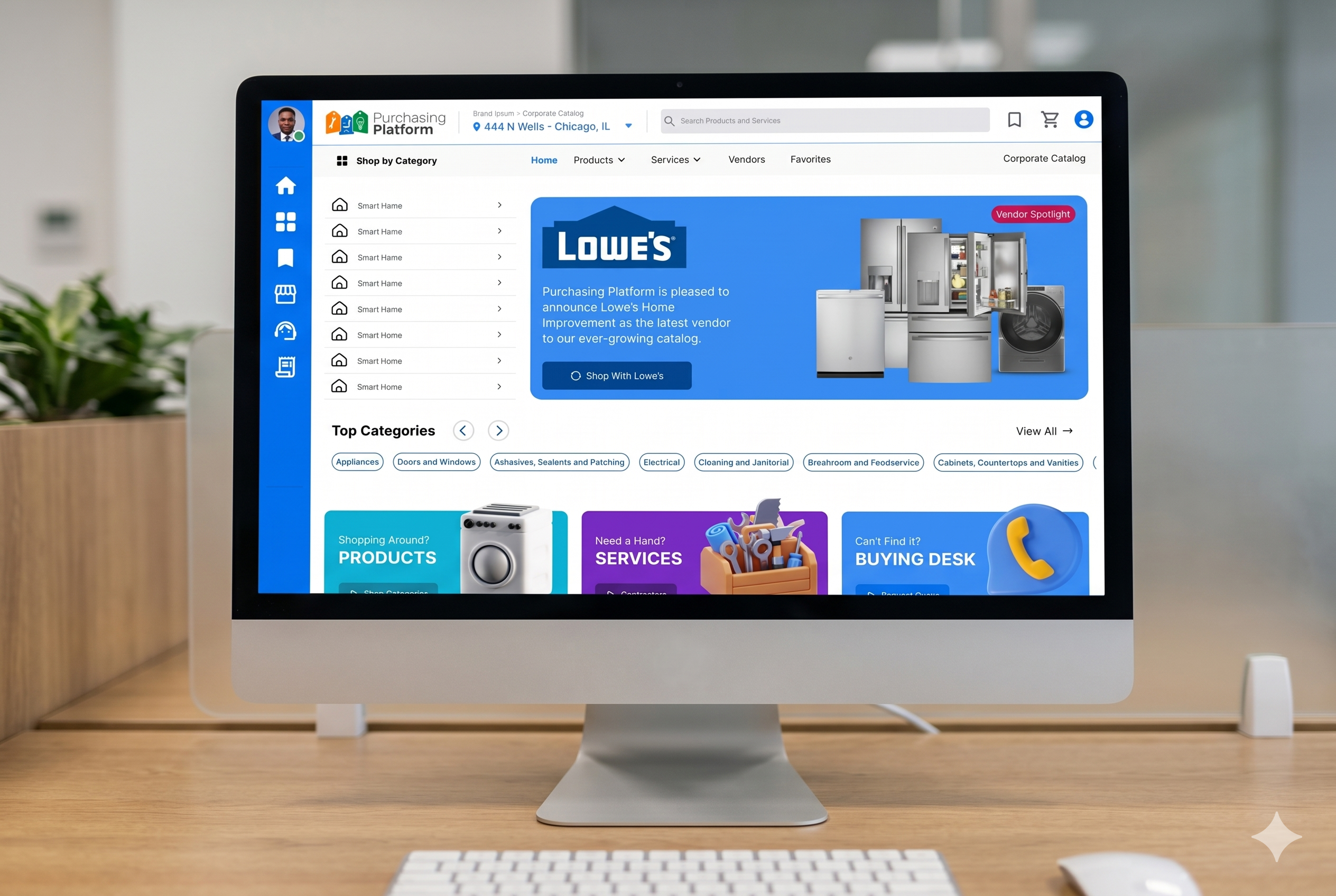
- Client
- A B2B procurement SaaS serving mid-market and enterprise buyers across North America
- Role
- Lead UX Designer
- Timeline
- 2024 – Present
- Team
- Cross-functional team of 6 (Product, Engineering, QA, Marketing)
The Challenge
The platform had a powerful AI search engine (HawkSearch) under the hood and no experience to match it. Navigation was a row of unlabeled icons. Search generated broken, dead-end URLs. The platform's most powerful feature — AI search across purchase histories, warranties, and supplier catalogs — was invisible to users and unknown to most of the team.
The mandate: make what exists work, introduce proven e-commerce patterns, then design the leap — an AI-native procurement experience.
What I Did
01 Design System
40+ button variants, no shared visual language, and every new feature compounding the inconsistency.
A token-first design system built in Figma — primitives through templates, every component documented with interaction states and responsive specs. Explore the live file below.
02 Mobile Experience
No responsive foundation — broken layouts, inaccessible touch targets, and purchasing flows that punished mobile users.
A mobile-first rebuild of the full journey — discovery, cart, checkout, support, and account — modeled on proven e-commerce patterns. Task completion rose across every flow.
03 Platform Navigation
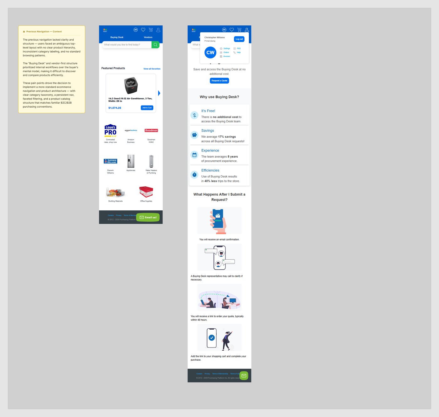
“Buying Desk” opened a quote form. “Vendors” led to info pages. Everything else was an unlabeled icon — and the storefront and admin ran on two different design systems.
Labeled, hierarchy-first navigation with breadcrumbs, unified across storefront and admin. One coherent product instead of two disconnected ones.
04 Shopping Experience
Refrigerators filed under “Anchors & Setup.” Broken search URLs. 83% mobile cart abandonment and an 85% exit rate right after purchase.
A rebuilt taxonomy that matches how buyers search, clean faceted-search URLs, product pages that build buying confidence, and a streamlined checkout — with HawkSearch reworked into rapid, navigable results.
05 Platform Redesign
The quick wins proved the platform could work — but they were still patches on an aging foundation.
A ground-up reimagining: full design-system overhaul plus mid-fi and hi-fi concepts for a search-first, AI-native procurement experience. Demonstrated to stakeholders and strongly received; cut before shipping by a market downturn.
How It Was Validated
- Heuristic evaluation against Nielsen's 10 usability principles
- Tree testing of the restructured navigation taxonomy
- Moderated usability sessions on search and registration flows
- WCAG 2.1 AA accessibility audit before handoff
After Launch
- Redesign concepts demonstrated to the full stakeholder group
- HawkSearch AI capabilities documented and socialized internally
- URL and breadcrumb patterns set as platform standards
- Continuous Hotjar session-recording feedback loop
The Outcome
The platform's AI was genuinely competitive — what was missing was the UX scaffolding to make it usable. Each workstream added a layer: a design system, mobile foundations, real navigation, and a validated vision for an AI-native future.
The Mobile Redesign




